Friday, November 28, 2014

Tile Place Cards for Holiday Meal

Last tile post for the day. (Year? Lifetime?) Because we had a number of considerations to balance--young kids sitting near parents, keeping the "big kids" together, a guest who's health mandated little movement--we needed designated seating for Thanksgiving. It seemed easier, and smarter, than leaving it to chance and having to play musical chairs with 16 17 guests after the fact.

We pulled out the turkey hand-print ones from last year, but while we had the same amount of guests, some players had changed. Crossing out names seemed a little low brow, so we searched for something that would look nice and be done quickly. I came up with this:
We just took a sheet of tile leftover from the new backsplash, pulling the tiles off the mosiac and writing names in dry erase marker. The teens enjoyed re-naming each other's place cards; most of that is not fit for print. Then, after dinner, we wiped the names off and stored the tiles in case we need to do any repairs down the line.

You could instead pick up a sheet of tiles just for this purpose, maybe even mix and matching from ReStore to save $$ and support a good cause. I liked that we can use them again and that they serve a utilitarian purpose as well.


Ara-basking in New Backsplash

We took the backsplash plunge! While I can infinitely explore the "what ifs" of most design decisions, my husband balances this tendency. After another dizzying visit to Floor & Decor (aisle upon aisle of options; it's overwhelming and amazing all at once!), where I searched for the "perfect" choice, he reminded me that there was more than one perfect choice. That many different tiles would look great in our kitchen, and it was a matter of making a decision and moving on. That we wouldn't be "wrong." Sage words. That led to:


It's the "Arabesque Lantern White Porcelain Mosaic" from Floor & Decor. Just $3.97 a sheet! Used their silver grout, which is just a little lighter than the cabinets. Easier to clean than white, and I like the contrast. The tiles themselves complement the farm sink, and have a simple elegance to them. 

While there are probably a million other tile combos that would have worked, I now have something that I love and the bonus of knowing we saved a ton (our other tile considerations were $10-$30 per sheet). I now find myself working from the breakfast bar to admire the end result, basking in the backsplash. 


Monday, November 3, 2014

The Backsplash Not Traveled (or, building a tile consensus)

About this time last year, our kitchen still somewhat of a construction zone, my husband and I volunteered to host Thanksgiving dinner. For 25 people.

We went into overdrive, putting drawers in the new pantry cabinet, putting kitchen items back in their rightful places after weeks of living in shelves in the dining and rec rooms. At some point, we switched into "as long as it looks good" mode. For instance, the trim on the top of the cabinets was not attached. Nor did we bother to do the part of it you couldn't see from the breakfast bar. Same goes for toe kick, bit of baseboard here and there, under cabinet lighting...while everyone oohed and aahed on the big holiday reveal, there was a lot of smoke and mirrors.

Which was fine. We knew we'd get to it "one day." Flash foward about 365 "one days" later and we realized it was time to admit we needed to call in our favorite handyman to finish the job for us. Plus, it turns out some of the money we saved on building cabinets unfortunately was needed for back surgery on my husband this spring. His days of heavy lifting are in the past. We may have overdone the DIY.

Ok, so our guy is scheduled. And his prices are so reasonable we can afford to have him do the backsplash while he's at it. Awesome, right? Except now I'm back to what feel like MAJOR KITCHEN DECISIONS. We worked so hard--like, husband slipped a disc hard--to get the kitchen to where it is today, I want to pick just the right tile. Within budget. That will not turn off sellers a few years down the road. I'm kind of in love with Twilight in Fiji from Floor & Decor:


All shimmery glass and the glass stick tile you see EVERYWHERE these days. But, at $17.99/sheet, it's a little spendy for me. And, hubs doesn't love it. (Or, he's smart enough to pretend to not like the most expensive choice.) I'm also digging on marble, it makes me think of old NYC apartments:

But, again, no consensus there. At $10.99/sheet, it's the middle ground, price-wise.


 Looks like we may compromise on the white porcelain Arabesque Lantern:

Pros: CHEAP, $3.79/sheet. White is elegant and classic; it also looks fresh against the Lidingo gray and will match our farmhouse sink. I love the Morrocan-flavored shape; it's exotic, but the finish and color mean it should still have mass appeal.
Cons: I'd secretly always pictured marble or some pop of color. I worry it will be too plain. Glass is very on trend, and I don't want to hurt resale or just wish I had something "fancier."

I guess I do like it, and think with light gray grout, it may be beautiful. And when I see similiar examples online, I love them:
Decor Pad | Utah Valley Parade of Homes

Guess I'm just fixated on the glass- or marble-road not traveled. I know, first world problems. If we go with the cheapest option, I'll donate some of the savings to things that actually matter. Sigh.


Thursday, September 4, 2014

Kitchen Post-Wall: The Open Look

One day, I really was going to go back and detail the full process of how we turned our cramped 1970s kitchen into our favorite spot in the house. But, as I come up on a year since the project started, it's time to admit that it ain't gonna happen. Besides, all people really want are pictures of the good stuff right? So here goes, starting with when we had a wall between the living room and kitchen, and when we didn't...

before and after, open kitchen renovation, removing wall

1970s kitchen renovation ikea cabinets open kitchen view from foyer

The "nook" in the foyer (below) is the old entrance to the kitchen, which is now moved down to the other side of the breakfast bar. It solved a flooring problem, namely that tile had been run past the end of the foyer...now we've incorporated that section into of the foyer. Also, it gave me something I've always wanted: space for a storage bench in my entryway. 

On the kitchen side, the fridge backs up to the nook, recessed so as not to block window sight lines. I opted to put my Hoosier in this corner, rather than add more cabinets. I worked hard on that baby, and love that we fit it into the reno (and saved $$ by doing so!). 

Fridge and hoosier cabinet recessed wall 1970s kitchen reno


For the fun of it, here's one during. See more pictures of the de-construction here.

The day this opened up, I sat on my couch with a glass of wine and just stared at this opening for like an hour. Partly marveling at how much that beam of wood added to the renovation costs (see the budget breakdown), but mostly at how drasticly the feeling of my home changed pretty much overnight. Ok, more pretty after "after" pictures to come.


Tuesday, August 19, 2014

For the Love of Couches, 3rd CL Find a Charm

I am taking the first step: I admit I have a couch problem. As I admired my mid-century modern style Craigslist find last night, it struck me that this is the third couch to occupy my living room. And we have lived here just shy of three years. Um...

Of course, for me, that's part of the allure of buying used furniture. I can afford to change it out on a whim. It's easy on the pocketbook and the environment. Plus, much like Tyler's "single serving friends" on "Fight Club," I almost always enjoy the people I briefly interact with through CL. Plus, I think this one's the keeper. No more couch hunting for awhile:

mid-century modern style sofa from craigslist moved in ford flex

I'd planned to get a vintage MCM couch for this wall, wanting that sleek, long look. It was on my "eventually" list. However, while shopping for a couch for the family room, I stumbled on this Kady couch for $150 and couldn't resist. It sells new at Macy's for $899! (Yes, I am picking up a different couch for the family room tonight. No, they do not have 12-step groups for CL addiction. I already checked CL.)

Due to my husband's bum back, and a birthday party that tied up my son and his friends, I needed to hire somebody to help me get the couch in the car. CL to the rescue again, where I found Frank for $30. I knew I had a good find when every time the seller left the room, Frank would whisper, "This is so nice. You're getting a great deal!" I'm also impressed that I fit this full-size couch in our Ford Flex. The gate even closed. Look! (We'd started to pull it out a bit before I took the pic.)

moved full size couch in Ford Flex sofa fit in flex
Even though I'd triple checked my measurements, I was worried if the couch would actually make it. I'd Googled "moving furniture in a Flex," hoping to find somebody who'd done it. Hopefully this pic will help somebody else out down the road. The secret was removing the legs, taking the height from 35" to 29".

The Flex is a superstar, 3-row box of an SUV/station wagon hybrid, and it's interior dimensions vary throughout the car. But all that really matters, for the sake of, "Will that fit?" are the lowest and most narrow points--at it's lowest, it's 32" high. At it's most narrow, by the wheel well, is 42". Depth is 78" (Or a little more if you can scoot the chairs up.)

I'll save how we turned the Flex into a camper this past weekend for another post. Suffice to say, I'm a huge fan of this car. Maybe I'll buy another on Craigslist. But only if it comes with a couch.


Wednesday, May 28, 2014

Tear Down The Wall...Kitchen Deconstructed

Once upon a time, our house was all about boundaries. Walls separating the living room from the dining room and kitchen. Built in pantries that blocked doorways when opened: 


After a few years of being separated from guests while I slaved away in the kitchen, I went all Pink Floyd on our house. It was time to TEAR DOWN THE WALL. With the help of some pros, due to a pesky load bearing beam


 I'm not sure if I should admit this, but the first night that the wall came down, I poured a glass of wine, sat on a the couch, and just stared in admiration. For like 30 minutes. On a Friday. Opening up our kitchen instantly transformed the entire first floor.

While we lived in a state of destruction and construction for about a month, and the dining room doubled as a pantry for most of that time, the renovation was planned in such a way that we never spent more than a few days without being able to use the bulk of our kitchen. Having all our appliances before it began probably helped.

Was I scared to change the architecture of our home? Absolutely. I went in circles worrying if I we might be ruining our property value, or if we'd regret removing what also served as a sound barrier. However, from the moment that light from the living and dining rooms first flooded into the kitchen, I've had no regrets. The space, and the people using it, are connected just liked we'd hoped. My advice about walls between where you cook and where you live--when in doubt, take it out.


Ikea Cabinets: A Sea of Boxes

It's one thing to hear that your Ikea kitchen will come in a million different pieces that need to be puzzled together. It's another to come home to delivery men turning your garage into a warehouse:


This picture is taken AFTER we'd pulled a number of boxes into the house to start assembly. It's overwhelming to say the least. Not to mention, it's recommended that you check each box against your order to make sure everything came as it should. This goes much faster as a two man job. Coffee doesn't hurt either.

When ordering Ikea or any RTA cabinets, be sure to clear space for the flood of cardboard coming your way. Preferably, this will include some horizontal space so that you can get to what you need without risking life and limb under a tower of cabinetry.

However, this sea of boxes is not as overwhelming as it initally seems. Each box is clearly marked with product numbers and dimensions. Just keep the inventory list handy to "decode" as you get into putting it all together. Plus, there's a certain satisfaction watching the pile get whittled away each day. Although you may not be very popular with your waste removal service on recycling day.

Tuesday, May 27, 2014

Claiming Lost Closet Corners

In theory, we have a large master bedroom closet. It is over 60 square feet. Unfortunately, that size takes the long way. It’s a little over 2 feet deep, stretching across 26 feet, the whole length of our room and the "short" wall of our bathroom. There are three points of access, each 4' wide. That means that means 10 feet of linear space is basically hidden behind walls. It's a no-man’s land, where clothes go to die.

Once something was hung in a wall area, it virtually disappeared. Plus, the ways the door slide, I could only see half of the “open” area at once. So, for instance, of the 80 inches of closet in the bathroom, I could only view 24" at a time. While my dream is to one day break through into the attic space behind the closet and build a to-die-for walk-in closet, I grudgingly have worked within the existing structure. With $21 worth of short shower tension rods, I regained 6 feet of closet space, turning those dark corners into useful space.


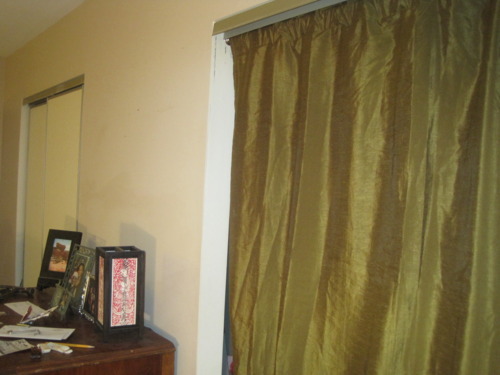
By installing the tension rods perpendicular to the existing closet bars, I can actually see and maneuver through everything tucked into the recesses. Next up is motion sensor lighting and replacing the doors with curtains--I used the green one as an experiment, but am on the prowl for something a little brighter. I'd take the tracks down and make the switch to French doors, but I'd rather put that money aside for my attic closet fund. After all, I'd hate for all that time I spent drooling over closet ideas on Pinterest to go to waste. #DreamBig :)

Sunday, May 4, 2014

Pallet Sectional - Final Look, Cost

Ta-dah! Here's the final set up for our pallet sectional. (The project was prompted when a snow storm took out our old deck furniture.) I love that the new set up can seat a bunch of guests for dining or make a cozy place to nap away a lazy afternoon. Below is the cost and material breakdown.
Pallet sectional outdoor


  • 8-wood pallets, 36"x48" each - $0
  • 6 - posts used for backs; scrap pieces from Lowe's - $0
  • 2-Beddinge futon mattresses, 55"x79" each (mattress 4" high, seat depth 31"), included covers - $35, CL
  • 2-vinyl zipped mattress protectors, queen size - $25
  • 1-32 oz 303 Products 30650 High Tech Fabric Guard w/ Water Repellant - $25.75 (paid $3.99 extra for 1-day ship) 
  • 8 - Ullkatus Cushions/Pillows from Ikea, green - $32 (sold in outdoor section, presumably meant for outdoor use)
  • 6 - Gulort cushion/pillows from Ikea - $18 (on clearance, believe they are being discontinued; treated w/ waterproofing spray)
  • Total Cost: $135.75

Sets with similiar seating capability run in the range of $1,500-2,500. So I'm feeling good about our final costs. Plus, we went big. If you were doing, say, a loveseat, you could spend much less.

Other cushion ideas include crib or foam mattresses or old couch cushions. You could even look for actual outdoor cushions at Big Lots or end-of-season sales. I hear some people do that; use things for their intended purposes. :) I wouldn't know anything about that, though. I do know that I'm really happy basically having two beds on my deck. So is our dog Buddha.


Friday, April 18, 2014

Making Futons Rain-Ready

Two Beddinge futons for very little scratch--check! Pallets lined up and ready for use as a sectional--check! Now, making it so that the futons would survive the outdoors...a little trickier. 

There are sources for futon covers made in water resitant fabrics. The cheapest I found was the Futon Shop, at $215 for a queen size. (Beddinge is slightly longer than a regular full.) That's way over budget BEFORE I times it by two. 

Plus, my CL futon finds had each come with covers. It made sense to try to reuse those. I crossed ideas such as fashioning cushion covers from picnic blankets, drop cloths or duck cloth off my list. Now it was all about waterproofing what I had. Time to get creative, do some research and keep my fingers crossed.

I orded two vinyl, zipped queen mattress covers on Amazon for a total of $25 (from Shop Bedding). This was a little more than the cost of the plastic ones, but from what I read would last longer and was less likely to tear. I looked for covers that claimed to block allergens, under the theory that they'd block my mattresses from mildew. We will see. 

When it came to waterproofing the fabric, the search was a little more daunting. Ever heard of fluorpolymer? Nope? Neither did the thousands of people who sustained respitory injuries by inhaling it when they used waterproofing sprays. I'm sure there are safe useage guidlines, but I'd like to pass on the poison.

And now the questions. There are a number of 100% wax solutions, DIY and premade. But, will wax leave the fabric to stiff? And how long would it take to wax two big futons??? Nikwax offers a non-fluorpolymer spray, but how many buckets of that will I need? A friend suggested just using fitted sheets and pulling off when it rains, but it seems a shame to not use the covers which of course will fit perfectly and look much more put together. Ok, back to the blogosphere to look for a solution.

The Great (Outdoors) Cushion Search

Getting pallets to create an outdoor sectional was easy and free. A local farmer posts an ad on Craigslist every time he has some to be picked up, about once a week. The tricky part was deciding what to do for cushions. If you've looked into it, than you know that outdoor foam is super expensive. I would have spent over $300 for two bottom cushions the size I needed, and still needed to come up with covering.

Thus began an OCD CL search, along with research into how other people handled the outdoor cushion on a budget dilemma. (I know...first world problems.) Daily I looked for foam mattresses or mattress covers, twin mattresses, futons. Anything I could possibly convert for my uses. 

I was excited to find a Beddinge futon for $35 just up the street from me. At 55" x 79", it was near perfect. I told the seller I'd pay full price for just the mattress and he agreed. I thought maybe I'd cut the mattress in half and use it for my bottom cushions, figuring out the backs later, or perhaps forgoing them.

Of course, this plan didn't stop me for searching for another Beddinge; how much cooler would it be to have two futons for lazing around on outside? I lucked into somebody giving one away for FREE. He even loaded it in my car and everything. I <3 craigslist.="" nbsp="" p="">

Both came with covers, so that's another item off the list. They don't match, one is a gray/black cotton cover with a quilted look to it (pictured below, right). The other is a charcoal gray tweed-look fabric. I'm pretty sure we can make it look intentional though and make use of both.
Now, to figure out how to water proof them...


Sunday, April 13, 2014

When Life Gives You Snow, Make New Furniture

Once upon a time, we had a patio canopy that looked like this: 


We entertained there often, it got a lot of use. However, the canvas roof was just as hard to take on and off as you might imagine. So, two winters in a row, we rationalized leaving it on. Until the day came that it looked this:


Kind of defeats the whole purpose of living in Virginia. Oh, and in case you're wondering what happend to the glass table underneath of it...

We went round and round on how to best replace our patio set-up. Build a pergola from scratch? Find another canopy? It crossed our minds to get a "conversational set," but the price tag scared us off. Plus, the table base and chairs had survived, so it seemed silly to spend $1,000+ when we could surely work with what was left.

Eventually, we decided to go the low budget--I mean upcycle--route. Presenting....drum roll....the table made from leftover pantry doors and a strip of wood from our old deck (it rests on base from old table):
To fill the door knob holes, I just used votive holders left over from our wedding.  **Note, I may be a border line hoarder. But stuff just keeps coming in handy, so it seems justified thus far.** 

The hinge is an experiment; if we like how it looks, we may make it so one side can fold up when we have a smaller group. The deck strip was added from necessity, it was needed for width, but it became our favorite part of the whole design. Adds some contrast and depth. 

I added a coat of paint to the doors and stained the raw edge of the wood. A few coats of poly will go on this week. It took my husband about 30 minutes to put together, and I've spent about the same amount of time with painting so far. 

It's already passed the "Cook Out and Cards Against Humanity" test: 

For seating, we are doing a hybrid of a DIY pallet sectional and some of the chairs from the old table. It's not blog-ready yet, but I'll post once it is. Anybody else furnishing their outdoor space? Any secrets for doing it on a budget? 


Sunday, April 6, 2014

Ikea Kitchen Budget Breakdown

Once upon a time, I naively thought we could remodel our 1970s kitchen for about $10,000. Then I did some research on material costs, talked to some contractors and took an honest look at our scope of work. This scope included:
  • Removing load bearing wall (see how we made that budget-breaking discovery!) between kitchen and living room
  • Widening the doorway to the dining room
  • Closing off an entry to the kitchen, extending foyer
  • Moving the stove, sink and fridge
  • Relocating the garage door
My revised, more realistic estimate was closer to $15,000, with a contingecy of $2,500. Eventually, we landed in the middle of those two numbers, spending a little over $12,000 (scroll for spending breakdown). The bulk of that came in construction costs (thanks load bearing beam!) and cabinets. Even with the Ikea 20% sale, we bought a LOT of cabinets, and splurged on getting mostly drawers for the base cabinets, a few glass uppers and extra organization, like lazy susans for corner cabinets. 

There are also some areas we haven't spent on yet. We put off the backsplash initially due to exhaustion; once the construction was done, my husband and I (along with some incredible friends) were the labor. Now, it just hasn't bothered us to not have backsplash, but I'm sure I'll get remotivated at some point and tackle that project. 

"The Help," AKA, husband and family friend
Also, our floor started as a mishmash of tile and wood. It remains that way. We used extra pieces of wood floor that we had on hand to fill in the gaps left by the remodel. It really doesn't bother me, but I imagine we'll make it either all tile or all wood before selling. Which means we have a few years to worry about it. 

My guestimate is that if we'd bought everything at full price and paid for somebody to do everything; design, construction, install cabinets, etc, we'd have spent closer to $25,000. I'll know for sure when we get our house appraised for refi this spring. Fingers crossed!!

Later I'll post where we saved, and where we spent a little more, often out of necessity. But for now, here's how it all played out:


Item/TaskBudgetNotes
Move Door, Fridge
Move stove
Hood Vent
Hood Vent Labor
Move wall, add beam
Add'l wiring
Total Construction6432Contractor
Floor wood, pro-(perm floor, pending)
Floor (vinyl click, us)20
Cabinets + wood counter5167.62
Lighting (use existing wiring)220
paint (us)80
knobs (Ebay)79
Backsplash(pending)
Install cabinets (us)
Supplies (us)145
Counter removal 225
Sink69
Stove750
storage bench, foyer70
bar stools 50
Subtotal13307.62
Subtotal13307.62
RecoupReturns, sold
Cabinets300
Counters & sink400
Stove350
Return cabinets
Return supplies50
Recoup total1100
Net Total12207.62

Sunday, March 30, 2014

Sneak Peek: Looking into New Kitchen

As I go through my chronologically-challenged blogging, I couldn't help but put a sneak peek of the finished product out there. Well, finished-ish...still have to do more trim, backsplash and a few other items that have been languishing once we got the kitchen to a useable space.

Here's the view of looking in from living room. We built the island using 39" Ikea lidingo wall cabinets facing into the living room (so much storage!!) and regular base cabinets for the front. My husband built a base that the cabinets rest on, and connected them to each other from the inside.


More to come soon, promise!

Planting Hope, Seed Day


March 30. I should be out prepping my garden beds. Instead, I spent most of the day gazing out the window dumbfounded by the mix of sleet and snow falling from the sky. Eventually I decided I could garden inside, turning the kitchen table into a potting station.
Turns out inside gardening is still incredibly relaxing. I'd had a headache since the night before. About an hour in I realized it had dissipated somewhere between the basil and Sicilian purple cauliflower seeds. I'd posted the above picture on Facebook and a friend commented that it was hopeful. 

That sounds about right: As I eagerly poured through seed packets, I was planning recipes for my future bounty. Completely discounting the reality that most of them won't even sprout (though I hedge my bets, putting a few seeds in each pot) and of those that do, only some will survive being transplanted into the ground and just a fraction of those will make the gauntlet of moles, slugs, deer and weather that awaits them outside. 

But for now, they are tucked safely in my windowsill, giving me something to look forward to. I guess it is spring after all!
Cake stand with dome makes for a pretty terrarium for sprouting seeds. 


Thursday, March 27, 2014

Stray Dog-ish Lamp Upcycle; From Brass to Kick-A$s

While we pushed to get our kitchen presentable by Thanksgiving so that we wouldn't have to serve our party of 18 Domino's, it meant cutting a few corners and deciding a couple of things were "good enough" for the time being. To this day, we have yet to add backsplash, and we reallly out to figure out why that light switch won't go all the way in...

Replacing the light over the eat-in portion of our kitchen fell in that category. Luckily, I found this whimsical lamp that would contrast so nicely with our dark gray cabinets and deep, red-brown koa floor:

At $675, this beauty from Stray Dog Designs with its paper mache leaves was only $575 over budget. Since this is more than we spent on any actual appliance, I couldn't quite justify the numbers. So, for $5 at our local ReStore, I picked up one of those ubiquitous brass lamps that hung in the foyer of every 1980's suburban home. 
A little on the shiny side, but that's why spray paint was invented. Plus, if you can look past the gleam, it actually has decent lines and detailing. Thus began my first paper mache project since elementary school! 
My "glue" was a simple mix of whole wheat flour--because it is all I had--and water. Just adding liquid and mixing until it had a glue consitency. With some trial, but mostly error, I experimented on the best way to form the leaves. Eventually the process was:
  • Layering several pages of newspaper, cut out dozens of leaf shapes
  • Wet a leaf "pile" with the flour glue using my fingers
  • Press a twist tie (nothing fancy here!) into the center of the leaf
  • Wet another leaf pile and press on top, squishing all around the center to make sure the tie is glued in
  • Place leaf on its edge on cookie tray; if placed flat it WILL stick to the tray
  • Bake at 200 degrees for 30 minutes

Yum...paper leaf nibbles, anyone? In addition to the baking, which was to guard against mildew setting in, I allowed the leaves to dry overnight on the counter. Next step was to line them up and spray them down:

The twist ties, I mean wire, are used for wrapping the leaves to the frame. I secured a few with an extra dot of glue, but for the most part, the wire seemed to do the trick. If it weren't for the darned spray paint, this would've been a very green project! 

I completely dismantled the light fixture for painting. The glass is still sitting in a pile, patiently waiting for me to have a stroke of genius on how to use it in another project. *Note: If you'll need to reduce the length of the chain, do it at this stage. Not after it's attached to your delicate finished work, when each link pried off is a chance to ruin your entire project and learn entirely new curse words. 

I hand painted the "candle" parts the same gray as our cabinets, and decided to make the tips of each junction point oil rubbed bronze. The rest got the blue spray paint treatment. Here it hanging in the laundry area, mostly painted and with a few of the leaves attached. I went witih round bulbs vs. the flame type that came with it, to give it a more modern look that was closer to my inspiration piece. 

And here it is proudly hanging at the front of our kitchen:


Obviously, it's not an exact match to the inspiration Adelaide pendant lamp, but I think it captures the whimsy of the leaves and bright color. Not to mention, I had the opportunity to match it exactly to the blue I used as an accent in the kitchen and the "Lidingo Gray" cabinets. (Lowe's did an awesome job of matching that!) Oh, and I saved like $665. 

Please ignore the patch work we need to do above the fixture. It is being added to the "we'll get to it later" list. Right after the back splash, and that wonky light switch.